
Wall Art Trends 2026: 10 Poster Styles Defining Modern Interiors

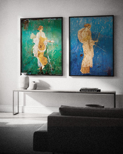
Flora Wall Fresco – Stabiae, Ancient Roman Painting Poster, our best-selling poster of 2026
Wall art in 2026 is more personal and less bound by rules. The ten trends that stand out are museum art at home (Roman frescoes and Matisse), warm earth tones paired with blue, expressive minimalism, looser abstract art, vintage-inspired posters, brutalist geometry, mustard and ochre yellow, moodier nature themes, typography with a point of view, and fewer but larger pieces.
This list is not a forecast. As a French poster studio, we looked at the posters our customers ordered between January and September 2026 and at how they hang them at home. Each trend below comes with what drives it, the rooms where it works best and a guide to go further. If you already know the look you want, the styles are gathered in our trending wall art collection.
Wall art trends 2026 at a glance
- Museum art at home: ancient frescoes and Matisse lead our sales.
- Warm earth tones: terracotta, sand and ochre, with blue as the favourite counterpoint.
- Expressive minimalism: fine lines and fluid shapes rather than cold geometry.
- Looser abstract art: texture, gradients and imperfect transitions.
- Vintage-inspired posters: retro prints that make a modern room feel lived-in.
- Brutalist geometry: concrete, grids and strong contrast.
- Mustard and ochre yellow: warm, muted yellows instead of bright ones.
- Moody nature: dried flowers, branches and dark landscapes.
- Typography with intent: one well-chosen line instead of a slogan.
- Fewer, larger pieces: one oversized poster instead of a crowded wall.
1. Museum art comes home: Roman frescoes and Matisse
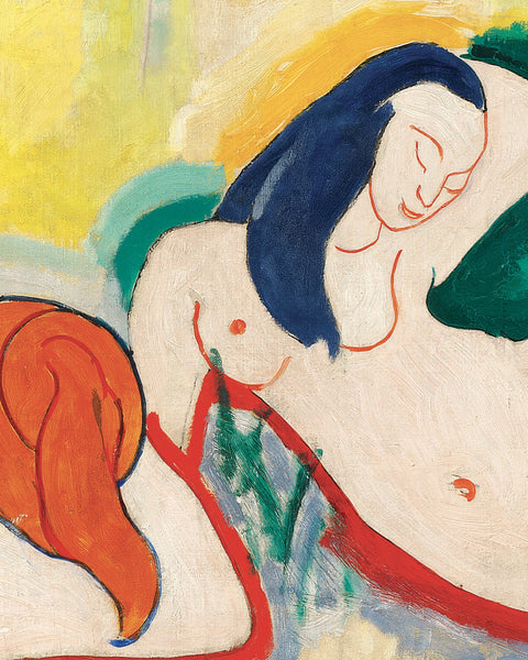
The clearest trend in our own orders is one most trend reports miss. From January to September 2026, about half of the posters our customers bought were reproductions of paintings, and two names stand out. Frescoes from Pompeii and Stabiae account for almost one poster in five, and our single best-seller is the Flora fresco, a 2,000-year-old figure walking through a green background. Henri Matisse comes right behind, with the same share. What these works have in common is a soft, slightly faded colour and a sense of history that a new print rarely has. A fresco brings warmth to a white living room. A Matisse cut-out or interior adds colour without looking loud. Explore our Pompeii fresco posters and our Matisse prints, or read why Pompeii's walls belong in your living room. For the story behind the cut-outs, read about the life of Henri Matisse.

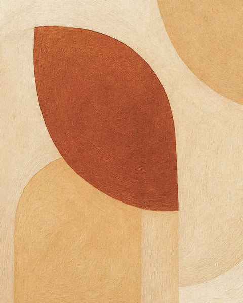
Autumn Foliage – abstract earth-toned leaf shapes poster
2. Warm earth tones still set the mood, with blue as the counterpoint
Terracotta, sand, rust, ochre and dusty rose remain everywhere in 2026. These shades soften a room without flattening it, and they sit well with homes that mix modern furniture with wood, linen and stone. A poster in these tones makes a room feel calmer and more lived-in. The surprise in our sales is how often blue comes with them: blue posters make up almost a quarter of what we sell. A deep blue or a sea green next to warm neutrals gives the eye somewhere to rest. Our beige posters cover the warm side, and our blue posters the cool one.

Inflections 04 – abstract print with curves and contrast
3. Minimalist posters are becoming more expressive
Minimalism is still very present, but it looks less generic than a few years ago. Simple graphic shapes with no emotional pull are giving way to abstract figures, fine line work, poetic silhouettes and compositions that leave room for interpretation. These pieces suit Scandinavian-inspired interiors, quiet bedrooms and gallery walls that need a calm element. If you like pared-back spaces, our minimalist posters are a good place to start.

4. Abstract wall art feels looser and more emotional
Abstract art is moving away from polished perfection. Visible texture, soft gradients, layered colour and uneven transitions are part of the appeal. You don't need to recognise a subject to react to these posters: the feeling comes first, the reading later. They work best in large formats, where the composition has room to breathe, and they give a room a focal point without adding clutter. Browse our abstract art prints to find one with the right depth for your space. To see where this freedom comes from, read our history of abstract art.

5. Vintage-inspired posters add character to modern homes
Retro exhibition prints, old-style food and drink posters and vintage travel designs remain among the most popular directions. Nostalgia plays a part, but contrast matters more: a vintage poster breaks the smoothness of a new kitchen or a minimalist living room and makes it look collected over time rather than bought in one go. They work well in kitchens, hallways and living rooms that feel a little too new. See our vintage posters and our Art Deco and Belle Époque posters. Much of the Belle Époque look goes back to Toulouse-Lautrec and his Montmartre posters.

Brutalist architecture poster – Modern concrete design
6. Brutalist geometry makes a stronger statement
Not every trend is soft. There is a growing taste for sharper, more structured wall art: brutalist buildings, architectural compositions and designs built on grids, solid forms and strong contrast. These posters look confident and graphic. They suit home offices, entryways and rooms with clean-lined furniture or darker finishes, where they bring a sense of order. Our brutalism posters are designed for that kind of space.

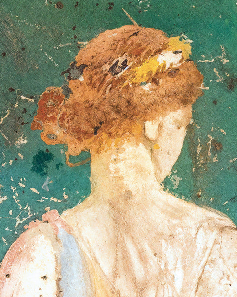
Pompeii Fresco Fragment with Muse Melpomene – Art Print
7. Mustard and ochre yellow, warm rather than bright
Yellow is back, but not in its loud, playful version. The shades we see most are mustard, ochre, butter yellow and golden tones, like the ochre background of the Melpomene fresco above. A touch of yellow brings life to a room that feels too grey or too muted, without making it heavy. It looks especially good with dark wood, cream walls or navy details. Our yellow posters explore this warmer, more refined side of the colour.

Dried Umbellifer Poster – Autumn Botanical Sketch
8. Nature themes take a moodier turn
Nature-inspired wall art is still everywhere, but bright green leaves and cheerful botanical clichés are giving way to dried flowers, muted florals, insects, bare branches and darker landscapes. The result feels more grown-up and fits modern interiors more easily. These posters are a natural choice for bedrooms and quiet living rooms, where the goal is a slower, calmer atmosphere. Have a look at our floral and botanical posters and our nature and landscape posters.

Arthur Rimbaud poster – "It has been found again. What? Eternity."
9. Typography posters with a real point of view
Typography is no longer a playful extra on a gallery wall. Text-based posters are now chosen with more care, for what the words say as much as for how they look. Some rely on elegant serif fonts and generous spacing, others are more graphic and direct. A line of poetry by Rimbaud does not set the same tone as a bold slogan, and that difference is the point. Typography posters work well in entryways, offices and reading corners. Our literature and poetry posters are a good starting point, and if you are curious about the letters themselves, read our history of the alphabet and typography.
10. Fewer, larger pieces instead of crowded walls
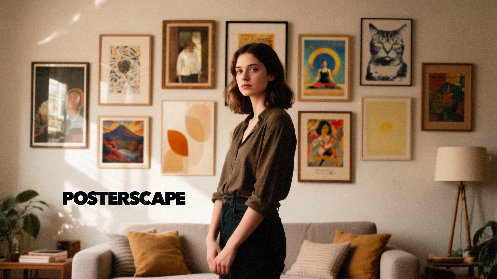
One of the most practical shifts in 2026 is the move toward fewer, larger pieces. Instead of covering a wall with many small frames, more people choose one oversized poster to anchor the room. Our orders confirm it: 50 x 70 cm (20 x 27.6 in) is our most ordered size, and about four posters in ten are 50 x 70 cm or larger. A single large image looks calmer and more deliberate, and it makes a room feel finished. It works especially well above a sofa, a bed or a dining bench, where scale matters more than most people expect. Our guide on how to choose wall art for your living room explains how to pick the right size.
What is fading in 2026
Trends also show what people are moving away from. These looks feel less current this year:
- Generic one-line drawings: faces and shapes with no emotion are giving way to expressive minimalism.
- All-beige walls: neutral palettes now need a contrast, often a deep blue or an ochre accent.
- Bright tropical leaves: botanical prints are turning to dried flowers, branches and darker landscapes.
- Loud slogans: text posters are chosen for a line that means something, not a catchphrase.
- Grids of small frames: one large poster, or a few pieces linked by a colour, now does the job.
How to style wall art in 2026
- Mix calm with contrast: pair one bold or graphic poster with softer pieces so the wall feels balanced rather than flat.
- Think about scale first: a print that is too small weakens the whole room. Above a sofa, aim for artwork about two-thirds of its width.
- Use frames to shape the mood: a black metal frame looks sharper and more graphic, while white or natural oak softens the look. With our framed posters, you only pay for the frame: the framing itself is free, and the poster arrives ready to hang.
- Let the room guide the palette: wall art does not need to match everything, but it should make sense with the colours already in the space. To find prints suited to each space, browse our wall art by room.
Wall art trends: frequently asked questions
What wall art is trending right now?
In 2026, the strongest wall art trends are reproductions of museum art (Roman frescoes, Matisse), warm earth tones paired with blue, expressive minimalism, textured abstract art, vintage-inspired posters, brutalist and architectural designs, mustard and ochre yellow, moody nature themes, typography and oversized single pieces.
Which wall art styles are trending for living rooms?
Large pieces lead in living rooms: a single fresco reproduction, an abstract print or a vintage poster in 50 x 70 cm or 70 x 100 cm above the sofa. Warm earth tones and blue are the most popular colours. See our living room wall art for ideas.
Which wall art styles are trending for bedrooms?
Bedrooms favour calmer styles: expressive minimalism, soft abstract art and muted botanical prints. See our bedroom wall art for ideas.
Which wall art styles are trending for home offices?
Home offices lean toward structure and calm: brutalist and architectural prints, Bauhaus graphics and soft gradients, which also look good behind you on video calls. See our office posters for ideas.
Are gallery walls still in style in 2026?
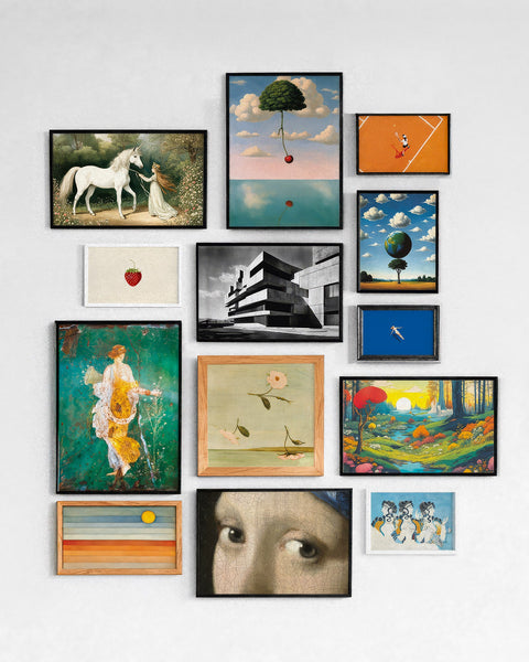
Yes, but they are more edited than before: fewer frames, a common colour thread and one larger piece to anchor the arrangement. Many people now prefer a single oversized poster to a wall of small frames.
Which wall art trends work in a nursery or kids' room?
The same move toward calm shows here: muted botanicals, gentle animals and soft pastel abstracts are replacing bright primary colours, and one or two larger prints often replace a crowd of small ones. Our nursery and kids' room wall art guide explains which sizes to choose and where to hang them.
How do I choose wall art that won't go out of style?
Start from a style you liked before it became a trend, keep the palette calm and the frame simple, and prefer one larger piece to many small ones. Subjects that have been hung for decades or centuries, such as frescoes, Matisse or botanical drawings, are a safe bet: they ride the trend without depending on it.
Trends are useful when they help you notice what already speaks to you. The best wall art of 2026 is not about copying a formula: it is about choosing posters that give a room a stronger atmosphere and a clearer point of view. To see the styles we are watching most closely right now, browse our trending wall art collection.


Leave a comment
This site is protected by hCaptcha and the hCaptcha Privacy Policy and Terms of Service apply.