
Selecting wall art for a living room seems straightforward, until you're stood in front of the wall, glancing between the sofa and the wall, and suddenly each little choice feels a bit weighty.
One framed poster or two? A full gallery wall? Something striking or something subtle? The comforting bit is that living room wall art needn't be complicated. Mostly, it just has to feel part of the room around it.
This guide covers the practical side of choosing art for a living room: scale, spacing, colour, mood, and layout, without turning it into a set of strict rules. The goal is a space that feels balanced, personal, and comfortable to live in.
Start with what the wall is doing
Before hanging anything, it helps to understand the wall’s purpose. Is it the main wall above the sofa? A backdrop behind a dining area in an open-plan layout? A stretch near the TV, a fireplace, a console table, or a reading nook?
A living room usually does a bit of everything: relaxing, chatting, reading, entertaining, and occasionally working. The wall decor should support how the room is actually used, not fight with the furniture or add visual clutter unnecessarily.
A wall that people see straight away can take stronger artwork. A wall behind the sofa suits a calm focal point better. A wall around a TV needs art that stands firm without clashing with the screen. The wall is more than empty space: it’s part of the room’s fabric.

In a room with warm, neutral tones, something like the Flora Wall Fresco – Stabiae – Ancient Roman Painting Poster adds a sense of history without weighing the space down. The green base, gentle movement, and antique feel give the wall real personality.
Get the scale right first
Scale is the easiest detail to get wrong, and the most common slip-up is going too small. A poster may look great in your hands but almost disappear once it’s up on a broad wall, drifting with no connection to its surroundings.
A handy guideline: art above a sofa should cover roughly two-thirds of its width. It doesn't need to be exact. If your sofa is 84 inches wide, aim for an arrangement about 56 inches across, which could be one large framed print, two medium ones, or a trio.
When a wall has lots of empty space, a single small print rarely suffices. It needs company: a second piece, a line-up, a gallery grouping, or one oversized work with enough presence to ground the room by itself.

Option 1: One statement poster
Often the simplest choice is the best one: a single striking poster, centred above the sofa or main seating. It gives the wall a clear focal point and keeps the room from feeling cluttered.
This works well if the room is already busy: patterned rug, full bookshelves, plants, lamps, open shelves. One confident piece gives the eye somewhere to rest.
For a colourful room, Le bonheur de vivre (The Joy of Life) – (1905) by Henri Matisse is the bolder pick. It adds energy but is anchored by a genuine art-historical reference, which stops it feeling like decoration for decoration’s sake.
Option 2: A pair of posters
Two posters can actually be easier to place than one. A pair adds structure to the wall and sits comfortably above a sofa, console, or low cabinet.
The trick is picking two pieces that speak to each other. They don’t need to match exactly, too much matching can feel like a showroom, but they should share something: a colour, a mood, a subject, or a similar level of detail.
You might pair Blue Atmosphere – abstract blue shapes poster with another calm abstract to keep things neat and modern. Blue tends to work well in living rooms because it softens the space without flattening it.
A pair looks best when both frames are the same size and carefully aligned. Keep the gap tight enough to seem deliberate, somewhere around 2 to 4 inches. Leave too much space and the two prints start to feel like strangers that happen to share a wall.

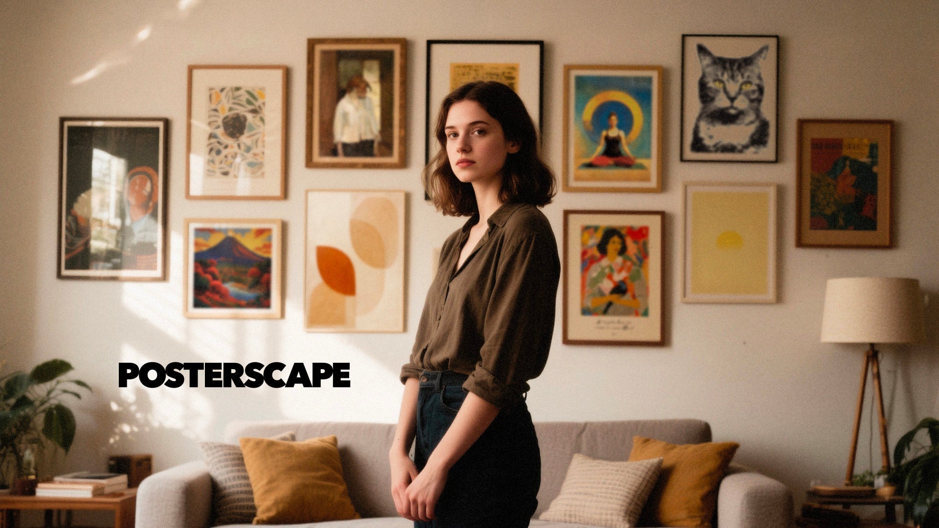
Option 3: Build a gallery wall, but keep it under control
A gallery wall is a solid solution for a wall that feels too empty. It fills space, adds character, and lets you display several pieces together. It can also become chaotic quite quickly.
The key is setting a few rules before putting a single nail in. Pick one frame colour. Limit the palette. Mix sizes, but not endlessly. Keep the spacing consistent. That’s the difference between a collected wall and a cluttered one.
The arrangement we return to most: one anchor piece surrounded by two to five smaller prints. The anchor gives the layout its backbone; the smaller pieces add flow. For a softer, more poetic grouping, Poème – Sun and Stars Poster pairs well with minimal or symbolic prints. For something with a surreal twist, World Tree – surreal Belgian poster adds an unexpected element: handy when a wall could use a little mystery.
One last step before committing: lay the frames out on the floor first. Photograph the setup, shuffle it, photograph it again. Sounds basic, but it saves the wall from becoming a patchwork of trial holes.
Option 4: Let the sofa lead
The sofa is usually the visual anchor of the room, so if the wall sits behind it, let the sofa set the rules.
Hang the art so its centre sits around eye level, then adjust for the sofa. In most homes, the bottom of the frame should be about 6 to 10 inches above the sofa’s back. Too high and the art floats off; too low and it looks squashed against the cushions.
Width matters too. The art doesn’t need to be wider than the sofa, usually it shouldn’t be. A print, pair, or grouping that spans two-thirds to three-quarters of the sofa width tends to feel right.
If the sofa is low and contemporary, a horizontal piece suits it. If the ceiling is high, a vertical poster or stacked arrangement helps use that height. The aim is for art that relates to the furniture beneath it, not hovering above it as if waiting for a swankier place.

Option 5: Use colour to tie the room together
Wall art shouldn’t match every item in the room, or it quickly feels stiff. But it should connect to the space here and there.
Look at the sofa, rug, curtains, lamps, wood tones, and cushions, then select art that echoes one or two colours already present. It can be subtle: a small blue shape picking up a blue cushion, a warm beige base complementing oak furniture, a green piece nodding to the plants.
This is where posters earn their place. They let you add colour without repainting a wall or replacing a sofa, cheaper, and far less drastic. If the room is mostly neutral, art can bring contrast. If already colourful, art can calm things down. Blue Atmosphere suits spaces seeking softness and shape, while Flora Wall Fresco pairs well with green, yellow, beige, brown, and natural materials.
Option 6: Mix art with shelves, lighting, and plants
Not every wall must be all framed art. You can mix artwork with other elements, provided the wall still looks organised.
A picture ledge is a clever choice if you enjoy changing art through the year; it lets you layer posters, small objects, and maybe a plant, without fixing yourself to one gallery layout forever. Wall sconces can frame a poster or group and make it feel intentional when the evening light’s on. A tall plant softens wall edges, especially in a bare corner.
For wider inspiration on combining furniture, lighting, storage, and decoration, the IKEA living room page is a handy spot to browse. The main lesson is simple: wall decor looks better when it belongs to the whole room, not just the wall.
How to choose wall art for a living room
If you’re choosing wall art for a living room, three questions get you most of the way there:
- Do you want the wall to feel calm or expressive?
- Do you need one focal point or several smaller pieces?
- Which colours already feature in the room?
For a calm room, lean towards abstract shapes, soft colours, botanical prints, or antique-inspired work. For a more expressive space, classic paintings, surreal posters, graphic art, or bolder compositions give the room more presence.
Our Wall Art for Living Room collection is a great starting point when you want posters that work well in real interiors, and the Trending wall art collection is worth a look if you want something current without chasing decor fads that fade in a season.
Common mistakes to avoid
A few pitfalls come up repeatedly.
The first is going too small. A wall with lots of blank space needs visual weight, so if a print is small, give it company, frame it with other pieces, or set it on a ledge with objects around it.
The second is hanging too high. Art should feel linked to the furniture beneath it. If people have to tilt their heads back to see it, it’s likely positioned too high.
The third is using too many styles at once. A living room can take contrast, but it still needs a common thread: colour, frame type, subject, or mood.
The fourth is trying to fill every inch. Negative space is doing serious work. A wall is allowed to breathe; it doesn’t need to be stuffed like a diner menu.

Simple layouts that tend to work
A handful of reliable starting points:
- One oversized framed poster: clean, simple, and easy to style.
- Two same-size posters: balanced and structured, especially above a sofa.
- Three posters in a row: great for long walls and open-plan rooms.
- One anchor piece with two smaller ones: a natural gallery-wall starting point.
- A picture ledge: flexible, relaxed, and easy to refresh.
- Art plus wall lights: useful when a wall needs more depth.
The right choice depends on wall size, ceiling height, furniture, and the mood you want. When in doubt, go bigger and simpler rather than smaller and busier.
Final thoughts
Choosing wall art for a living room isn’t about filling space just for the sake of it. It’s about giving the room some character. Start with scale. Pick a layout that suits the furniture. Use colour to link the art to the room. Then leave some space to breathe.
At Posterscape, we see wall art as more than decoration. The right poster sets the mood of a room and makes an empty wall feel deliberate. And sometimes it does all that with just one frame, one nail, and five minutes of courage.
FAQ: how to choose wall art for a living room
What is the best way to choose wall art for a living room?
Start with the room itself. Look at the sofa, the wall size, the existing colours, the lighting, and the overall mood, then choose art that feels connected to those elements. A single framed poster, a pair of prints, or a gallery wall can all work; what matters most is getting the scale right.
How big should wall art be above a sofa?
As a general rule, wall art above a sofa should cover about two-thirds of the sofa’s width. That could be one piece or a group of smaller ones. The bottom of the frame should generally be about 6 to 10 inches above the sofa back.
Should I use one artwork or several smaller pieces?
Choose one artwork when you want a clean, calm focal point. Use several smaller pieces for a more personal, layered wall. Both options work in a living room, as long as the whole arrangement stays balanced with the furniture.
How do I decorate a blank wall without making it look cluttered?
Limit the number of colours, keep frame styles consistent, and leave space around the artwork. A controlled gallery wall or one oversized poster can fill the wall without making the room feel crowded.
What type of wall art works best in a living room?
It depends on the room. Abstract posters, classic art prints, botanical pieces, surreal posters, and soft graphic compositions all work well. The best choice fits the colours, furniture, and mood of the space.
Can I mix different poster styles on the same wall?
Yes, provided you keep one thing consistent: the same frame colour, a shared palette, or a similar mood. That common thread makes different artworks feel connected rather than random.
How high should I hang art in a living room?
The centre of the artwork should usually sit near eye level. When hanging above a sofa, place the bottom of the frame about 6 to 10 inches above the sofa back so the art feels linked to the furniture.
What can I put on a living room wall besides art?
Picture ledges, wall lights, shelves, mirrors, and plants all work, individually or combined. The strongest walls tend to blend decor with a bit of structure, while still leaving enough empty space for the room to breathe.

Leave a comment
This site is protected by hCaptcha and the hCaptcha Privacy Policy and Terms of Service apply.